Color Calibration: Getting Perfect Prints
The frustration is universal: you spend hours perfecting an image on your monitor, only to receive prints that look nothing like what you expected. Colors appear dull, skin tones look unnatural, and that vibrant sunset becomes a muddy mess. This disconnect between screen and print affects everyone from casual photographers to professional designers, but it's entirely preventable with proper color calibration.
Color calibration isn't just for high-end studios or professional photographers. Understanding and implementing basic calibration principles can dramatically improve your print quality, regardless of whether you're printing at home or ordering from professional labs.
Why Colors Don't Match Between Screen and Print
The Fundamental Challenge The core issue is that monitors emit light while prints reflect it—two fundamentally different ways of creating color. Your monitor can display brilliant blues and vibrant greens that simply cannot be reproduced with ink on paper. Additionally, no two devices interpret color identically, even monitors of the same model from the same manufacturer.
Common Misconceptions Many people assume that digital technology means perfect color reproduction. This assumption is incorrect. Digital cameras, monitors, and printers all have their own color characteristics and limitations. Even expensive cameras can capture colors differently than you remember seeing them, and inexpensive monitors often have significant color bias toward blue or other hues.
Environmental Variables Room lighting dramatically affects both how you see your monitor and how prints appear. The color temperature of your workspace lighting, the brightness of your monitor, and even the color of your walls can influence color perception. These factors compound the challenge of achieving consistent results.

Understanding Color Spaces and Profiles
What Color Spaces Mean for Printing Color spaces define the range of colors that can be displayed or printed. Most monitors target the sRGB color space, which works well for web viewing but may be limiting for high-quality printing. Adobe RGB (1998) offers a wider range of colors more suitable for print work, while ProPhoto RGB provides the widest gamut but requires careful handling.
The critical concept is "gamut"—the range of colors a device can reproduce. Your monitor may display colors that your printer cannot recreate, resulting in "out of gamut" colors that get substituted with the closest printable alternative. This often affects the most saturated colors: bright greens, vivid magentas, and neon yellows.
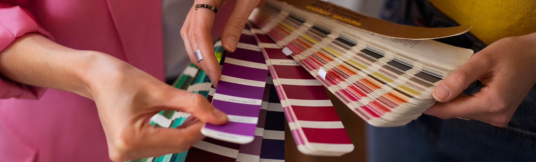
ICC Profiles: The Translation System ICC (International Color Consortium) profiles act as translators between devices. They tell your computer exactly how each device handles color, enabling accurate color translation from monitor to printer. Every combination of printer, ink, and paper should have its own unique profile for optimal results.
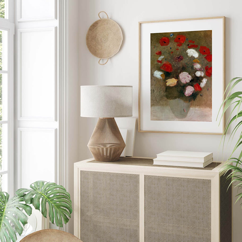
Professional print labs provide ICC profiles for their specific equipment and paper combinations. These profiles are essential for predictable results when ordering prints online. This is particularly important when working with high-quality digital art downloads, where the original file quality must be preserved through the entire printing workflow.
Monitor Calibration Fundamentals
Hardware vs. Software Calibration While both Windows and macOS include basic calibration tools, they rely on your visual judgment rather than objective measurements. Hardware calibration uses a colorimeter—a device that actually measures your monitor's color output—to create precise corrections.
Popular hardware calibrators include the Calibrite Display series (formerly X-Rite), Datacolor SpyderX, and professional solutions from companies like X-Rite. These devices typically cost $150-500 but provide dramatically more accurate results than visual calibration methods.
Critical Calibration Settings Professional printing workflows use specific calibration targets. Set your monitor's white point to D50 (5000K) for print-focused work, though D65 (6500K) is acceptable for mixed workflows. Brightness should be between 80-120 cd/m², significantly lower than most monitors' factory settings but essential for matching print brightness.
Set gamma to 2.2 for most printing applications. This may make your monitor appear dimmer than you're accustomed to, but it provides accurate preview of how prints will appear under proper viewing conditions.
The Calibration Process Hardware calibration involves placing the colorimeter on your monitor while software displays a series of color patches. The device measures what your monitor actually produces versus what it should display, then creates a correction profile. This process typically takes 15-30 minutes and should be repeated monthly, as monitors drift over time.

Printer Calibration and Profiling
Why Printer Profiles Matter Each combination of printer, ink, and paper produces unique color characteristics. Glossy paper typically produces more vibrant colors than matte paper, while different ink formulations affect color reproduction. Professional workflows require separate profiles for each paper type used.
Creating accurate printer profiles involves printing test targets containing hundreds of color patches, then measuring these with a spectrophotometer. The device compares intended colors with actual printed results, creating a custom profile that compensates for your specific equipment's characteristics.
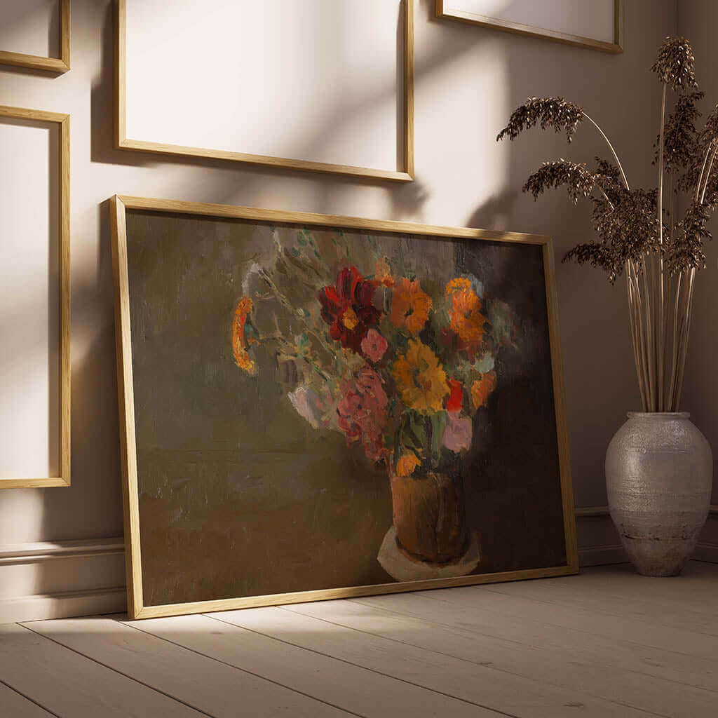
This process is particularly crucial when printing digital art from high-resolution files. Whether you're working with museum-quality reproductions downloaded from platforms like MangoHoo or other digital art sources, maintaining color accuracy from the original file through to the final print requires proper calibration at every step.
Working with Professional Labs If you use commercial printing services, request their ICC profiles for the specific papers you plan to use. Many labs offer custom calibration services where they provide test prints to help you match your monitor to their output. This service is particularly valuable for photographers who regularly order prints.
Different print media require different approaches. Standard photo paper, metal prints, canvas, and acrylic all have unique color characteristics. Some labs provide specific profiles for each medium, while others use general profiles that work across multiple paper types.
Setting Up Your Work Environment
Lighting Requirements Consistent lighting is crucial for both calibration and print evaluation. Professional standards call for 5000K daylight-balanced lighting with a Color Rendering Index (CRI) of 95 or higher. Standard household lighting—incandescent, fluorescent, or LED—often has color casts that interfere with accurate color judgment.
Position your monitor away from windows with changing daylight, and avoid editing images under mixed lighting conditions. If possible, use dedicated photo editing lamps that provide consistent, color-neutral illumination.
Physical Environment Considerations Neutral gray walls provide the most accurate viewing environment, while colored walls can create color casts that affect perception. Even your clothing can influence color judgment—wear neutral colors when making critical color decisions.
Your monitor should warm up for at least 30 minutes before calibration or critical color work. Displays need time to reach stable operating temperature for consistent performance.
Soft Proofing: Previewing Print Results
Simulating Print Output Soft proofing uses your calibrated monitor to simulate how images will appear when printed. Professional software like Adobe Photoshop includes sophisticated soft proofing tools that can preview different paper types and printing conditions before you commit to expensive prints.
Soft proofing reveals which colors in your image are out of gamut for your chosen printing method. These preview tools can simulate the exact appearance of different papers, showing you how images will look on glossy versus matte surfaces, or how metal prints will differ from traditional photo paper.
Limitations of Soft Proofing While extremely useful, soft proofing cannot perfectly replicate printed results due to the fundamental differences between emitted and reflected light. The goal is to get as close as possible while understanding that some variation is inevitable.
Use soft proofing to identify potential problems before printing, such as colors that will appear flat or muddy, or areas where detail might be lost in shadows or highlights.

Common Problems and Solutions
Prints Appear Too Dark This frequently occurs when monitor brightness is set too high. Calibrate your monitor to the recommended 80-120 cd/m² brightness level. Additionally, verify you're using the correct ICC profile for your specific paper type.
Color Casts in Prints Unexpected color casts usually indicate monitor calibration issues or incorrect printer profiles. Ensure your monitor's white point is properly set and that you're using the correct profile for your printer and paper combination.
Inconsistent Results Inconsistency often stems from changing environmental conditions or outdated calibration. Maintain consistent room lighting and recalibrate your monitor regularly. Also ensure you're using the same print settings and paper types between print runs.
Oversaturated Prints If prints appear more vivid than your monitor display, your monitor may be under-calibrated or you may be working in too wide a color space for your output method. Consider using sRGB for consumer printing or ensure your print lab can handle wide-gamut files.
Building a Reliable Workflow
Step-by-Step Process Establish a consistent sequence: calibrate your monitor regularly, use appropriate color spaces for your intended output, apply correct ICC profiles when printing, and evaluate prints under proper lighting conditions. Document your settings and procedures to ensure consistency.
This workflow becomes especially important when working with downloadable digital art files that need to maintain their intended color characteristics. High-quality digital art downloads, such as those available from specialized platforms, often come in multiple resolution options optimized for different print sizes, making proper color management essential for achieving the artist's original vision.
Quality Control Measures Create a standard test image that includes various skin tones, neutral grays, and saturated colors. Print this image periodically using your established workflow to monitor consistency over time. This helps identify when recalibration is needed or when print lab quality has changed.
Managing Multiple Outputs If you print both for web viewing and physical prints, consider creating multiple monitor profiles. Use a web-optimized profile for online work and a print-optimized profile for physical output. Modern calibration software can manage multiple profiles and switch between them as needed.
Cost-Benefit Analysis
Entry-Level Solutions Basic hardware calibrators start around $150 and provide significant improvement over visual calibration methods. This investment typically pays for itself by reducing wasted prints and reprints.
Professional-Grade Equipment Advanced colorimeters and spectrophotometers cost $300-1000+ but offer features like ambient light measurement, advanced profiling options, and support for specialized display technologies. These tools are essential for commercial work but may be overkill for casual users.
Return on Investment Beyond the obvious benefit of accurate colors, proper calibration saves money by reducing reprints, builds confidence in your workflow, and enables you to charge premium prices if you're selling prints. The time savings alone often justifies the investment in proper calibration tools.
Maintenance and Long-Term Success
Regular Maintenance Schedule Recalibrate monitors monthly for critical color work, or every 2-3 months for general use. Verify printer profiles periodically, especially when changing ink or paper suppliers. Clean printer heads regularly to maintain consistent color output.
Staying Current Monitor and printer technologies evolve continuously. Stay informed about updates to ICC profiles from your print labs, and consider upgrading calibration hardware every 3-5 years as display technologies advance.
Troubleshooting Resources Maintain relationships with technical support from your calibration hardware manufacturer and print labs. Many problems can be resolved quickly with expert guidance rather than extensive trial and error.
Color calibration requires initial investment in time and equipment, but the results—predictable, accurate prints that match your creative vision—make this effort worthwhile. Whether you're printing personal photographs, professional artwork, or high-quality digital art downloads for home decoration, the difference between calibrated and uncalibrated workflows is immediately apparent in print quality. Once you experience truly accurate color reproduction, working without calibration becomes unthinkable.