Small Space Wall Art Solutions
Living in a small space doesn't mean sacrificing style. The right wall art can make your tiny room feel twice as big. After helping countless clients transform compact apartments and tiny homes over the past decade, I've learned that small spaces need smart solutions, not small thinking.
Go Big in Small Spaces

Forget the "small space, small art" myth. This is the biggest mistake I see homeowners make. One oversized piece creates more visual impact than a dozen scattered frames. Interior designer Kelly Wearstler consistently recommends this approach: "A single large artwork commands attention and makes a space feel intentionally designed."
The 2/3 rule is your sizing secret weapon. Your art should measure about two-thirds the width of your furniture. For a standard 84-inch sofa, choose artwork between 56-63 inches wide. I've tested this formula in hundreds of small living rooms, and it never fails to create perfect proportions.
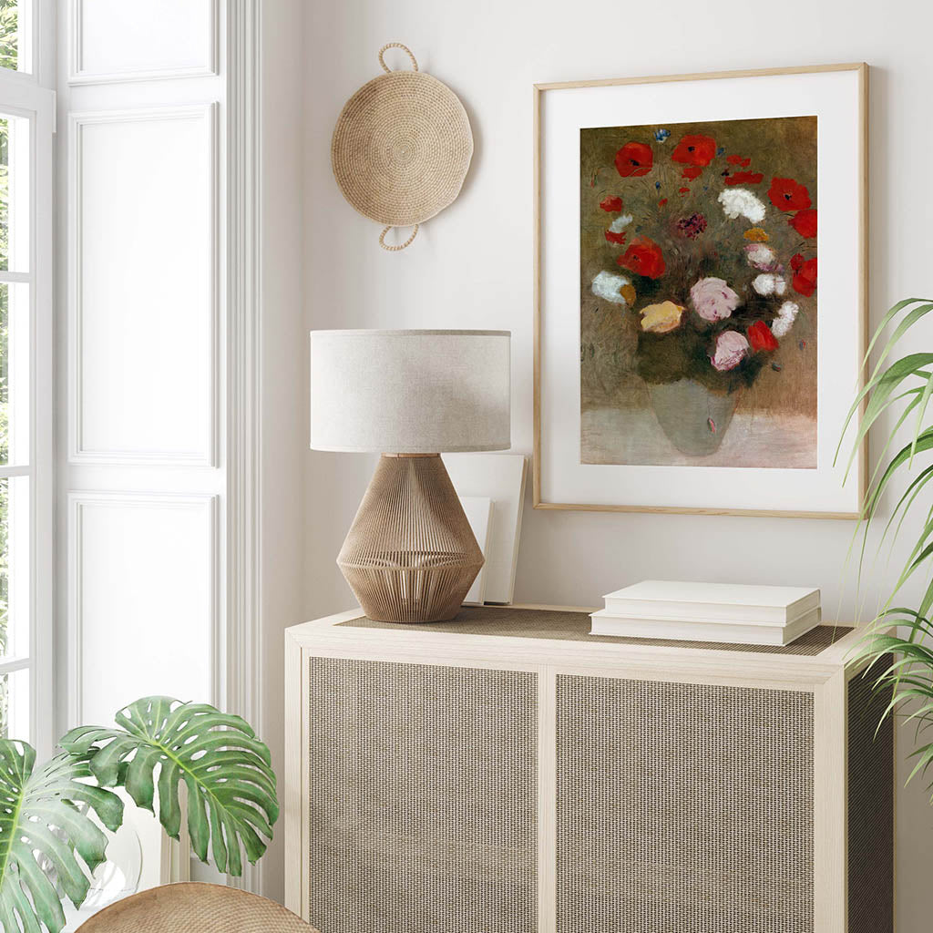
Scale creates the illusion of space. A 30x40" landscape print above a compact sofa makes the wall appear to recede, visually expanding the room. This optical trick works because large art draws focus away from the room's actual dimensions. Printable art offers unique advantages here - you can print the exact size your space needs without being limited by pre-framed options.
Height placement matters more than you think. Hang artwork 57-60 inches from floor to center, even in rooms with 8-foot ceilings. This standard gallery height, used in museums worldwide, ensures optimal viewing from both standing and seated positions. Drawing eyes upward makes ceilings feel taller - a technique I use in every small space project.
Horizontal vs. vertical orientation affects perception. Landscape-oriented pieces make narrow rooms feel wider, while vertical pieces add height to low-ceiling spaces. Choose orientation based on your room's biggest limitation.
Make Your Walls Work Harder

Strategic mirror placement doubles visual space. Position mirrors opposite or adjacent to artwork to reflect both the piece and natural light. This technique, borrowed from luxury hotel design, can make a 200-square-foot room feel like 400. The reflection creates depth while the mirror itself becomes part of the art display.
Floating shelves solve the storage-style dilemma. Install 2-3 shelves at varying heights to display small art pieces, books, and decorative objects. This approach gives you gallery wall impact without the commitment. Professional tip: keep 60% of shelf space filled to avoid clutter while maintaining visual interest.
Lighting transforms ordinary art into focal points. Picture lights or track lighting add drama while serving practical purposes. According to lighting designer Randall Whitehead, "Proper artwork lighting should be 3-5 times brighter than ambient room lighting." Battery-operated picture lights offer flexibility without rewiring costs.
Multi-functional wall elements maximize utility. Wall-mounted desks that fold down, magnetic boards that hold art and notes, or pegboards that display tools and small artwork all serve dual purposes. In my Chicago studio apartment, a large pegboard displays changing seasonal prints while organizing office supplies.
Gallery wall alternatives for small spaces. Instead of traditional gallery walls that can overwhelm compact rooms, try the "salon style" approach: group 3-5 pieces closely together on one wall section, leaving other walls breathing room. This creates impact without visual chaos.
Professional Design Strategies

Color psychology affects spatial perception. Light, cool colors (blues, greens, soft grays) make walls appear to recede, while warm colors (reds, oranges, deep yellows) advance toward you. Use this knowledge strategically - cool-toned art on the far wall makes rooms feel deeper.
Monochromatic schemes create cohesion. Choosing art within the same color family makes small spaces feel larger and more sophisticated. Design firm Studio McGee frequently uses this technique, selecting artwork in varying shades of blue or gray for seamless visual flow.
Textural variety adds interest without clutter. Mix smooth photography prints with textured canvas paintings or woven wall hangings. This layering creates visual depth while maintaining the clean lines small spaces require.
Seasonal rotation keeps spaces fresh. Professional stagers often change artwork seasonally to maintain buyer interest. Apply this principle at home by rotating 2-3 pieces quarterly. Digital prints make this cost-effective - store files digitally and print new pieces as desired.
Scale relationships throughout the room matter. Your largest art piece should be the room's visual anchor, with smaller pieces supporting rather than competing. Follow the 60-30-10 rule: 60% large pieces, 30% medium pieces, 10% small accents.
Professional installation ensures proper impact. Use picture ledges for frequently changed displays, French cleats for heavier pieces, and museum putty for lightweight prints. Proper hanging hardware prevents damage while allowing flexibility.
Budget-conscious solutions that look expensive. High-quality digital prints in simple frames often look more sophisticated than cheap pre-made art. Focus budget on 1-2 statement pieces rather than many mediocre ones.
Key takeaways: Small spaces need strategic thinking, not downsized dreams. Choose fewer, larger pieces. Use height and light to your advantage. Make every wall element serve multiple purposes. Your compact room can achieve the sophisticated style typically reserved for larger homes.


